Smart Check
QA for email design
Year
2025
My Role
Product Designer
Tools Used
Figma, Miro, Ballpark
Dev Methodology
Shape Up

Case Study
Context
Beefree is a drag-and-drop HTML email builder for marketers, agencies, and enterprise teams. I was the solo designer on this project, working with a Product Manager, Frontend/Backend engineers, and QA over 6+ months.
Problem
Users were catching critical errors (broken links, oversized images, poor color contrast) after exporting or after sending their email. Way too late. Manual pre-send checks were slow and unreliable, and there was nothing built into the editor to help.
We got signals from interviews, surveys, and sales calls to map the problem, then ran dedicated interviews to understand context and priority. A survey helped us prioritize which checks actually mattered most to users.

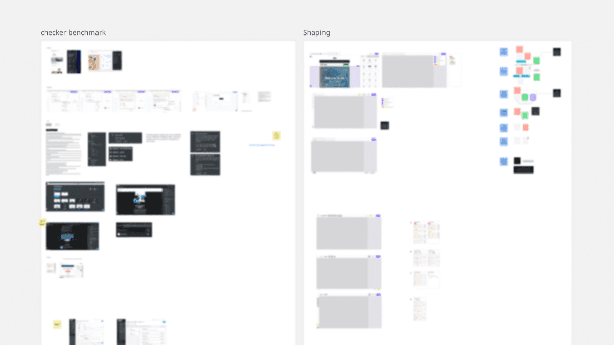
Process
Processs used followed Shape Up best practices: problem definition, shaping, validation, dev cycle, release, iteration.
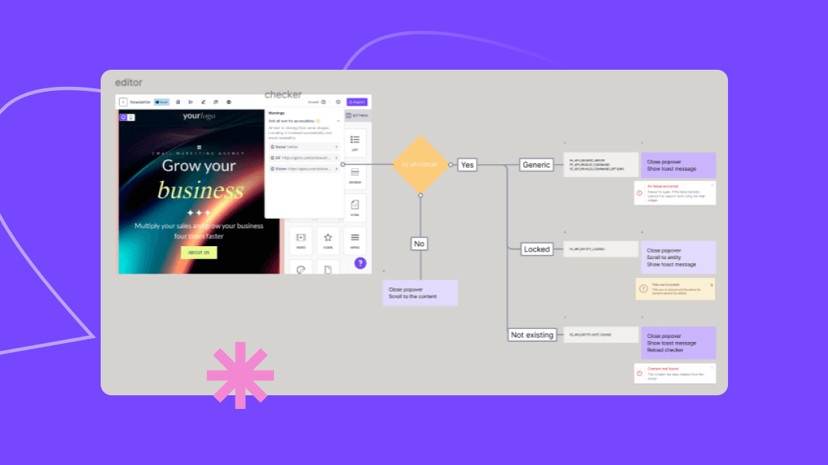
A big chunk of shaping was invisible work: mapping how Smart Check would behave across roles, plans, and permissions. We also did a technical feasibility pass early to understand what we were actually able to build.
The hardest constraint was the UI: we couldn't redesign the entire editor UI, so we had to add a new icon to an already crowded header. Not ideal, but it was the right call within our timeline. That made naming and discoverability even more critical.
Usability testing shaped the concept significantly: icon, name, UX copy.
Post-launch, we noticed adoption was okay but icon clicks were lower than expected. We added an animation to the icon and it moved the needle significantly.
User feedback after launch wasn't complaints. It was requests for more checks. That's a good sign.